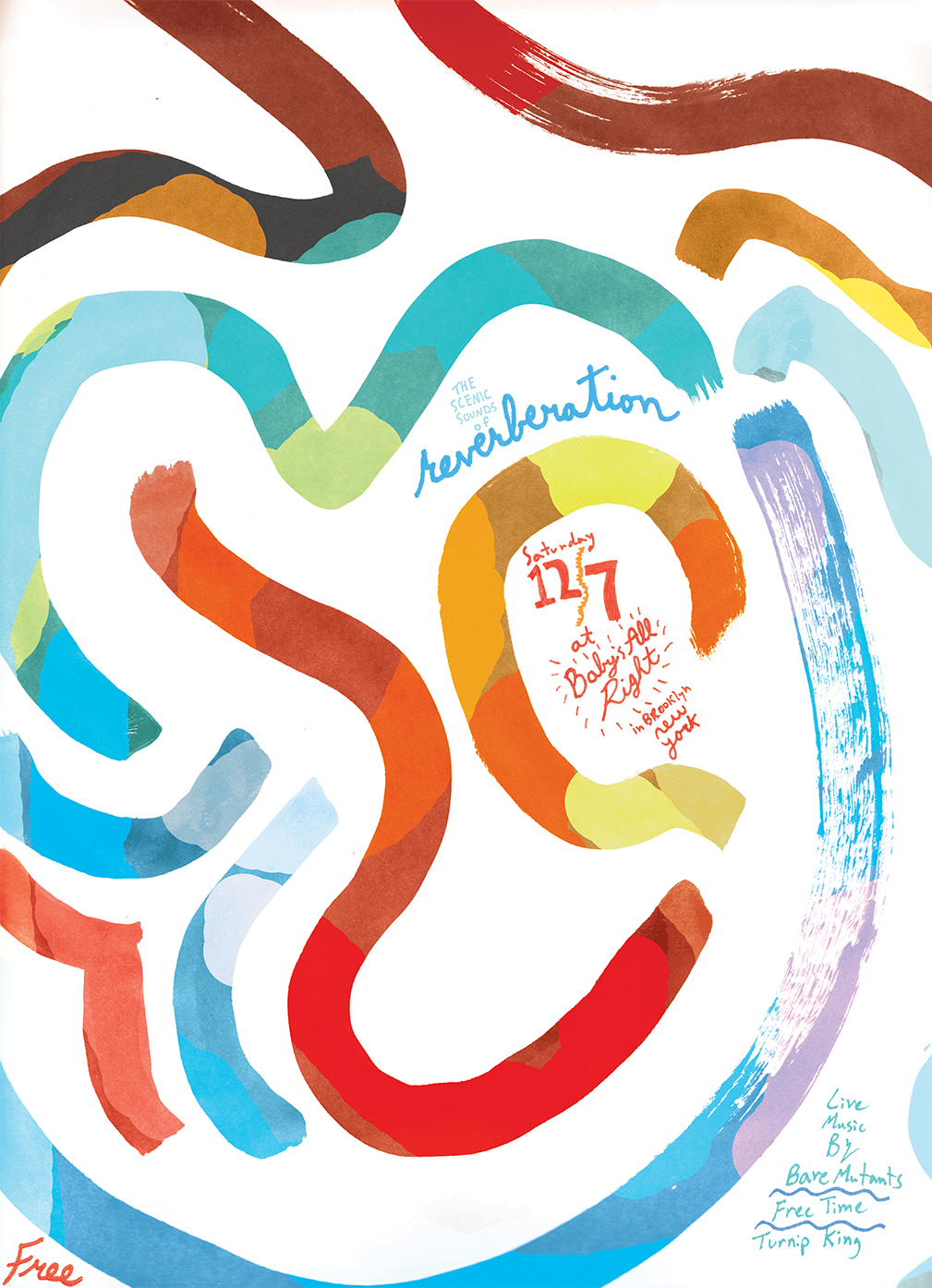
Great poster by Robbie Simon for Allah-Las band – more cool posters on Robbie Simon’s website
Great poster by Robbie Simon for Allah-Las band – more cool posters on Robbie Simon’s website

Jenny Grigg’s design for Eleanor Catton’s The Luminaries
A great book cover for this year’s Man Booker Prize’s winner. More about the design on the Creative Review’s blog

Design: Paula Scher for Pentagram
New poster that features custom typography inspired by the NT’s original home at the Old Vic. More on the Pentagram website

Design by Jon Gray for Harper Collins – http://gray318.com
Another inspiring event at the St Brides Library with the Stories from the Fold packed evening. Ten speakers presented their works and gave an insight into the world of design. Aside from amazing projects and book covers I’ll keep the following bits in mind from the evening:
– yes… but what is the book adding to the TV series? what will make people want to buy this book? (Zoe Bather on designing Brian Cox’s books series and her journalistic work bringing fascinating details alive in the book with great infographics)
– we are all hunter-gatherer. we are all searching for that new something. don’t stop trying new things, even if it’s just starting to use a new typeface. (Jon Gray on taking on design brief).
Here’s the full programme with links worth checking out

Wonders of Life’s. Infographic by Nathalie Lees. Book design by Zoe Bather. http://zoebather.co.uk

Design Brian Webb http://www.webbandwebb.co.uk/

Design David Pearson for Pushkin Press http://www.davidpearsondesign.com

Book design by Clare Skeats for Pushkin Press http://www.clareskeats.co.uk/
Illustration by Julien Pacaud http://www.julienpacaud.com

Book design by Jon Gray http://gray318.com

Little Red Hood. Design by Marjolaine Leray for Phoenix Yard Books http://marjolaineleray.com/

This year’s poster for the famous French tennis competition has been designed by British sculptor David Nash who is a pioneer of Land Art, an artistic movement using nature as a raw material. David Nash’s material of choice is wood.

With a navigation discretely sitting at the bottom of the page this homepage for the ‘Art of Change’ exhibition at the Hayward Gallery is leaving the main space to a nice combination between type and photography.
Last week I met Kathleen McCormick. She’s a basket weaver from Galway in Ireland. Kathleen was making some amazing baskets in a shop around the work where I work. It was part of the Design festival and she was there for the all weekend. Around her were amazing willow baskets and some made from barks. Shame I didn’t have my camera on me but here’s a photo with a similar birch bark texture.

there’s a portrait and interview with Kathleen on the Makers and Brothers website.